Friday, 1 May 2015
Friday, 24 April 2015
Ancillary Task - Magazine Advert
 This is my magazine advert for my digipak. As you can see from the image I have chosen to have rather dark house colours, this is because I really like the idea of using silhouettes and creating them myself as I have demonstrated in previous posts.
 Also the genre of my Music Video is a sub-genre of Indie music and from research I noted that indie music is all about personality and individuality, which is what I wanted my advert to have. While also having its own sense of character
The Main Cover Image is a tiled college of the musical artists face. I wanted to use this because I thought it was a quite unique idea and would draw in an audiences attention. I have then placed three silhouettes on to of the main image, the first being the large tree. Second the three birds and thirdly the couple who're holding hands.
I chose to place the silhouettes on top of the background image because I believe it gives my advert a sense of character and moves away from the main conventions of other magazine advertisements.
The text on my advert is minimal and this is because I wanted the audience to focus mainly on the images. The main head of the advert is the artists name in a bold font with a white outline to make it stand out that much more. The other text is a basic 'OUT NOW' announcement and the name of the album/digipak. There is also a small three word review type quote at the foot of the page and an RSS scan which allowed me to incorporate social media without it being all over the page.
My Production company name is also in the left corner of the header of the page, its of a low opacity as I didn't want it to stand out to much and take attention away from the actual advertisement.
People silhouette cont...


Digipak editing cont...
This is a photograph I have taken to use as a silhouette on my Digipak and advertisement. Using photoshop I will cut out all of the background and use a colour overly to gain the silhouette affect.

Monday, 30 March 2015
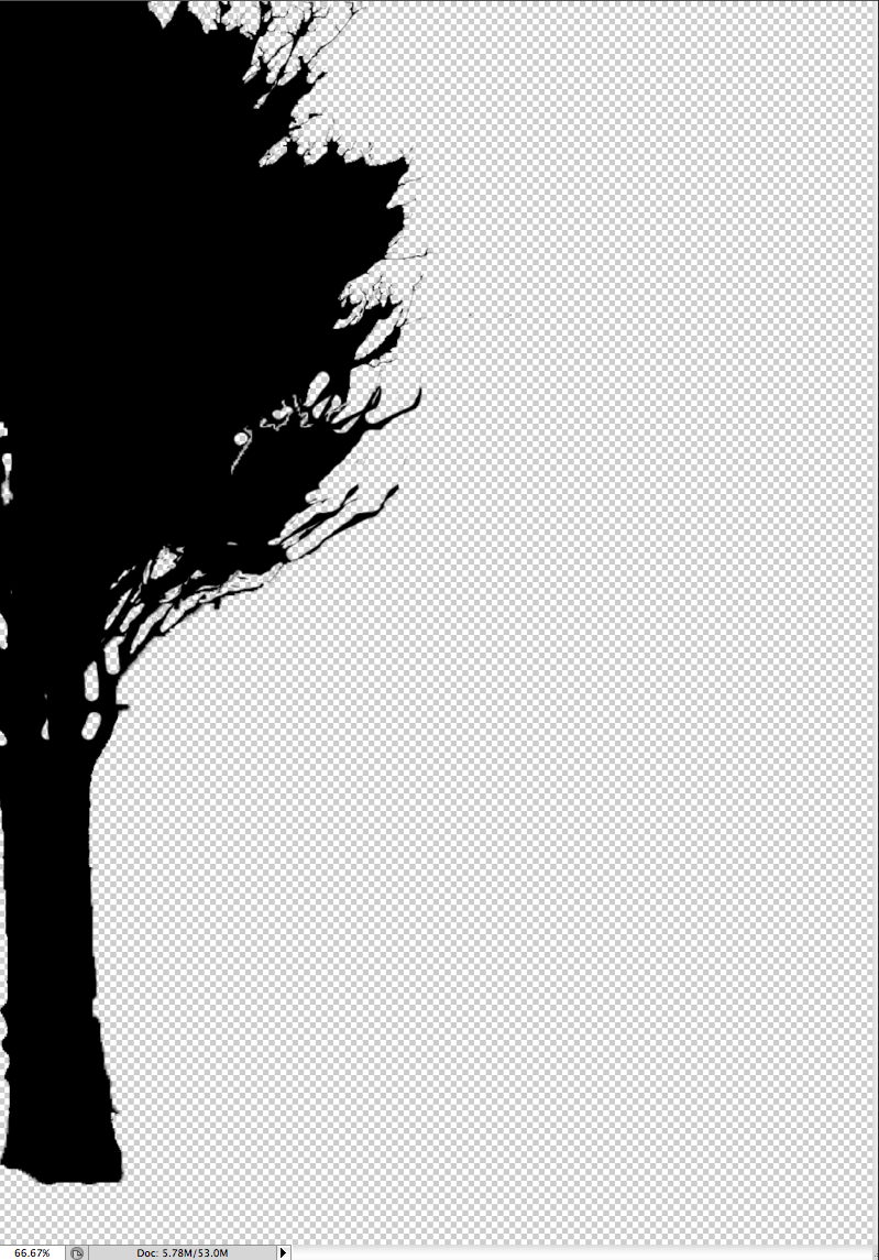
Post-production Tree Silhouette


In this post I am showing you how I developed my image of a tree into a silhouette, and how I layered it to make it seem fuller than it already is. To begin with, using the magic want tool and also the quick select, I cut out the majority of the background. I then added a black colour overlay, which made the tree a silhouette. From this I then began to duplicate the layers and place them over each other so that the tree looked larger, as originally it seemed a little small. I added four duplicate layers to build on the tree and my finished product is the last image on this post.


Thursday, 5 March 2015
Decisions, Decisions, Decisions...
I have came to the conclusion that I do not like the majority of my video footage, however I would like to stick with my original idea but re-film a couple scenes to make them less choppy and unprofessional. This re-filming should only take up a weekend, and with the co-operation of my actors I believe that I can get everything done in that short space of time.
Subscribe to:
Comments (Atom)